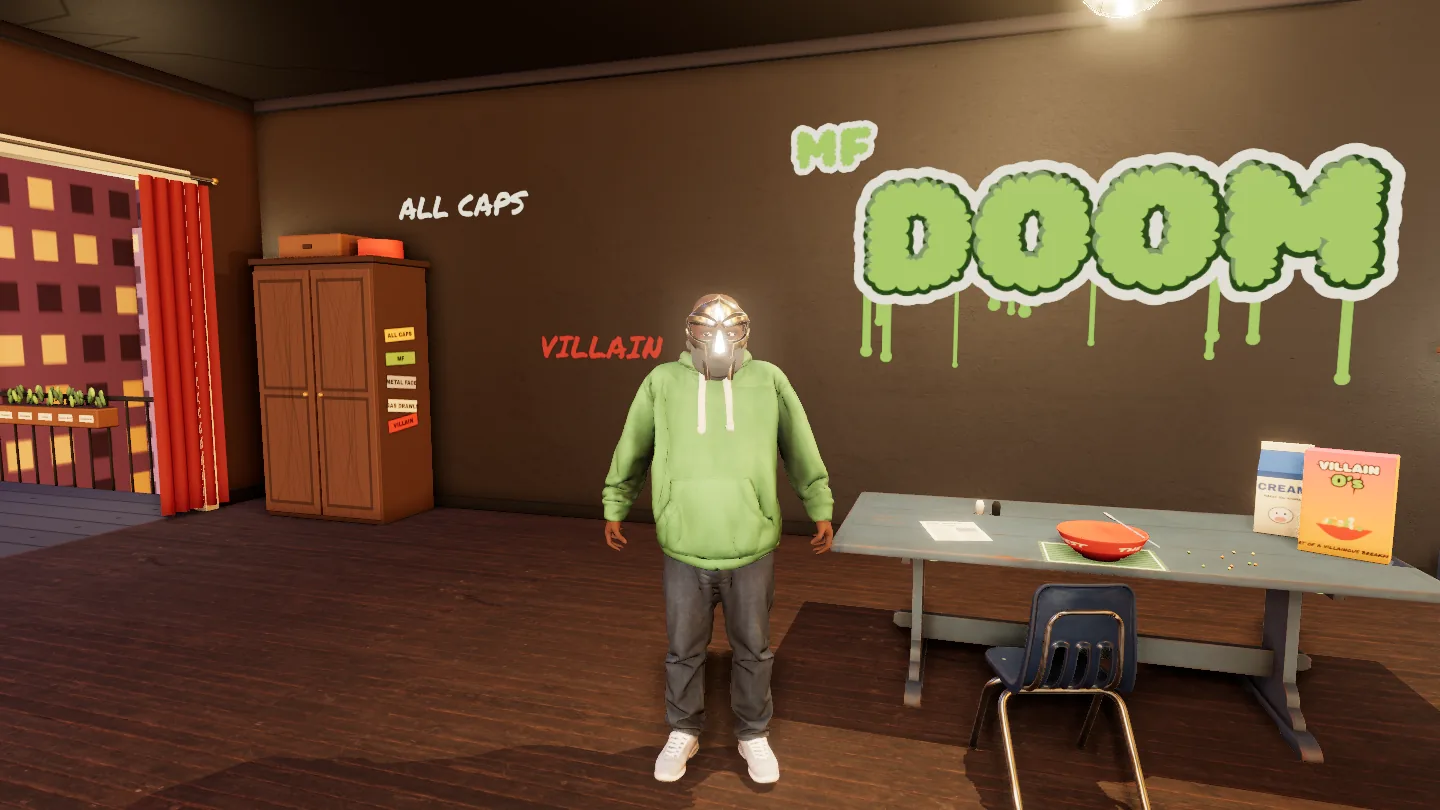
The cover of MM..FOOD is a man in a metal mask eating cereal. I wanted to walk into that painting, sit him down and pour the milk. So I asked Claude to build it.
01The idea
My Listening Room has a neon sign on the wall with a DOOM lyric on it. That was a nod. This is the whole thing.
Daniel Dumile died in 2020. He left behind a body of work that rewards you for paying attention: every album is a different character, every beat on Special Herbs is named after a herb or a spice, and you have to write his name in capitals or you've spelled it wrong.
A list of facts about him would miss the point. He hid things. So the tribute had to be a place you poke around in.
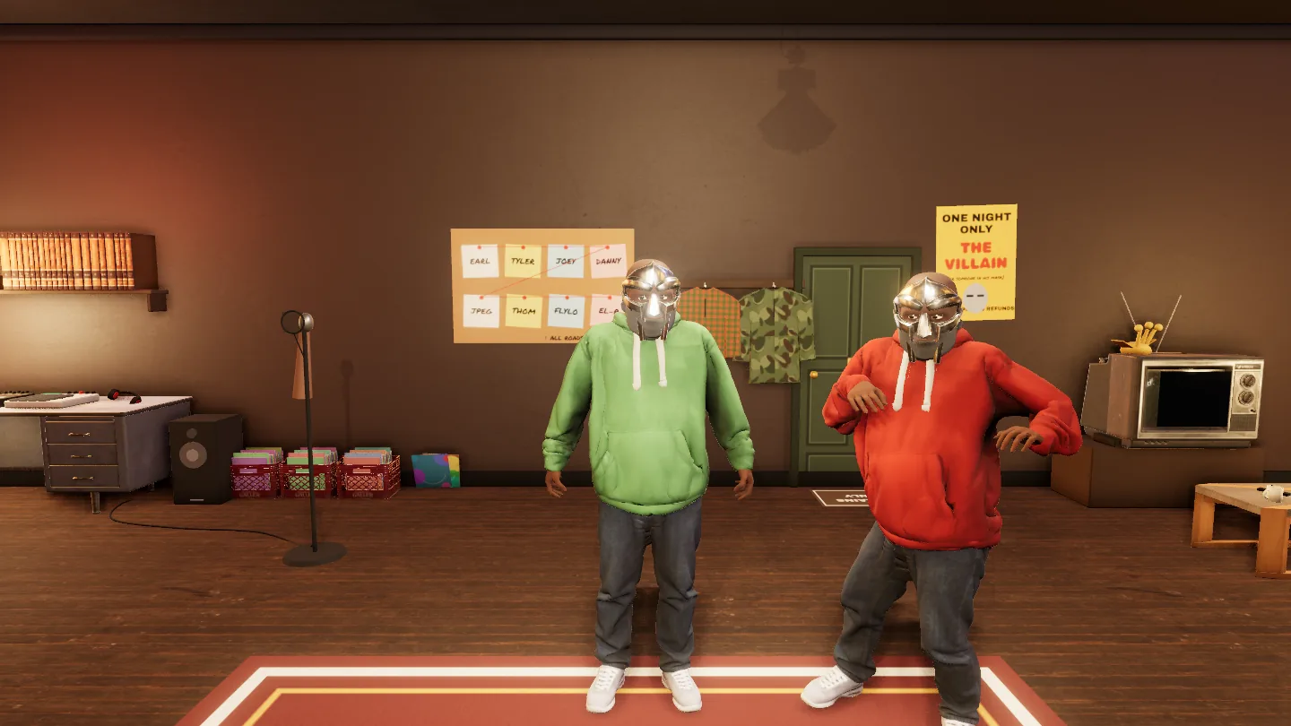
ALL CAPS is a room you walk around in your browser, as DOOM. There are six things to do, nineteen secrets to find, and 77 records in the crates. All the music is real: 30-second previews from Deezer and Apple Music.
02The brief
My first message set the idea and the order of work. The last five lines were these:
First research
Then help me plan
Then design
Then build
Then deploy
That's a normal project plan, and Claude followed it. It came back with research on the cover and on the man, a plan, three questions (new repo or existing, first or third person, one corner or the full room), and then it built.
An hour after the first message there was a room on a live URL, with a blocky DOOM made of code who could eat cereal. The other sixteen hours went on making it good.
03What got built
What you can do in the room:
- Eat breakfast. Sit down, pour the cereal, pour the milk, eat. It's the cover.
- Cook. Every dish is a track title from MM..FOOD. Pick one and find its three ingredients.
- Make a beat. Sixteen pads and a step sequencer, swung at 88 BPM.
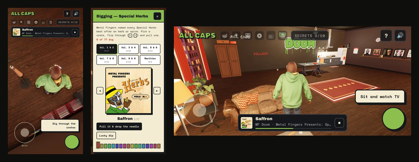
- Dig the crates. All 77 Special Herbs instrumentals across six crates. Pull one and it plays. There's a counter for how many you've dug, and one record at the back of the last crate has no name.
- Watch cartoons. Sit on the sofa and flip channels.
- Finish the rhymes. A notebook with the last word missing from each line.
- Find the secrets. Nineteen of them: a wardrobe, a telescope on the balcony, a calendar with the wrong birthday, a milk carton asking if you've seen someone.
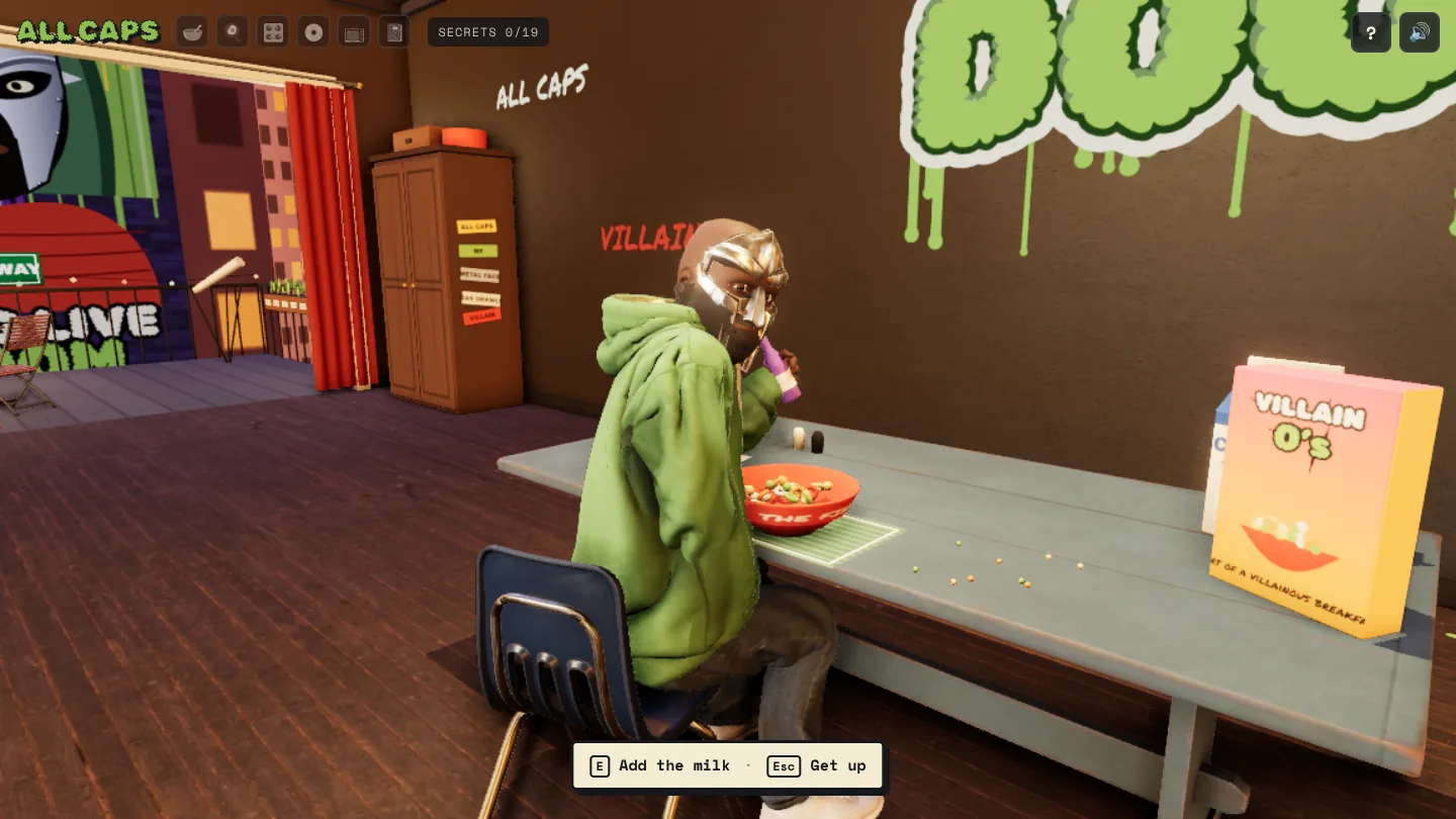 Breakfast
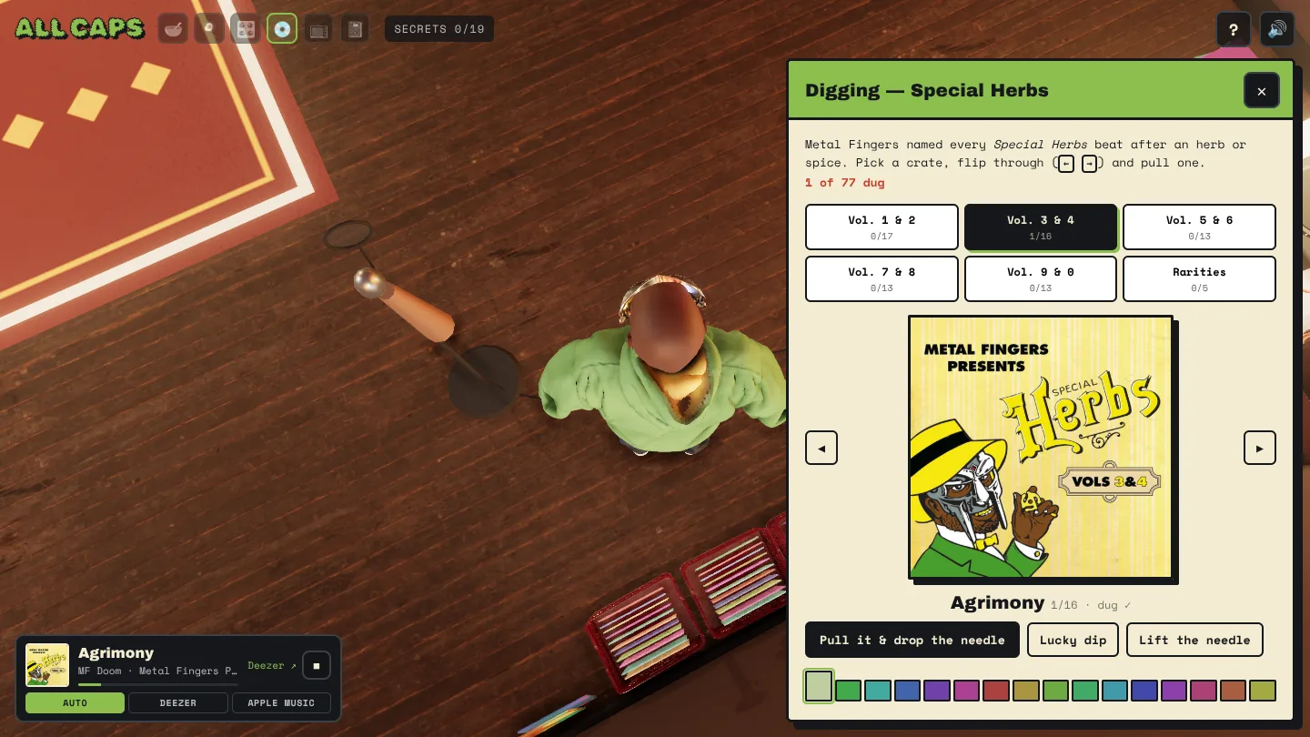 The crates
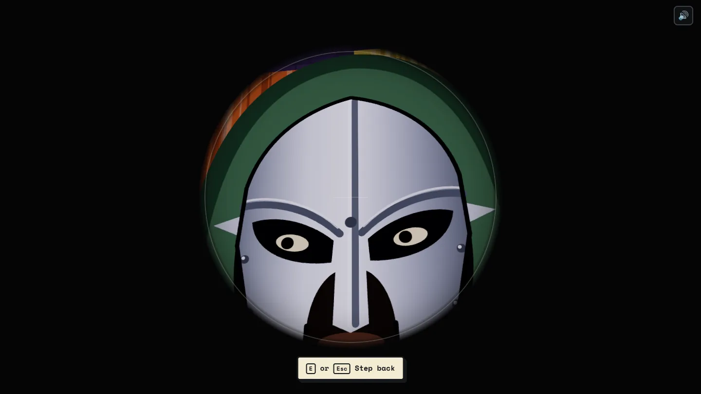 The telescope
04The look: I polished the wrong thing for hours
This is the part I'd do differently, so it gets the most words.
The first version looked like a cartoon: flat colours, black outlines, a character built from boxes and cylinders. It worked, and it wasn't what I wanted. I asked for something else:
I want to explore a hand drawn but more realistic graphic style and art direction. Help me to do that
Claude built a set of styles I could flip between: pencil, ink, gouache, ink with a colour wash. I picked ink and gouache. Then I spent the afternoon asking for more detail, better hands, more lifelike movement, a better mask. Each round was better than the last. None of them was right.
Around hour eight I said what I should have said at hour two:
Im wondering how we go more photo realistic here, we're not making a stepped improvement
And a few minutes later, looking at yet another round on his hat:
the hat is off, but we should stop and improve with photorealism instead
That one message changed the project more than the fifty around it. Real materials, real light from a photographed room, furniture scanned from real objects. The drawn styles are gone from the final thing.
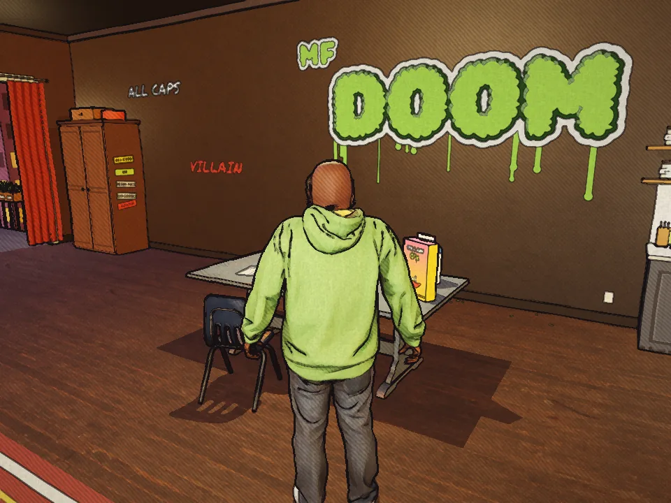 Ink & gouache
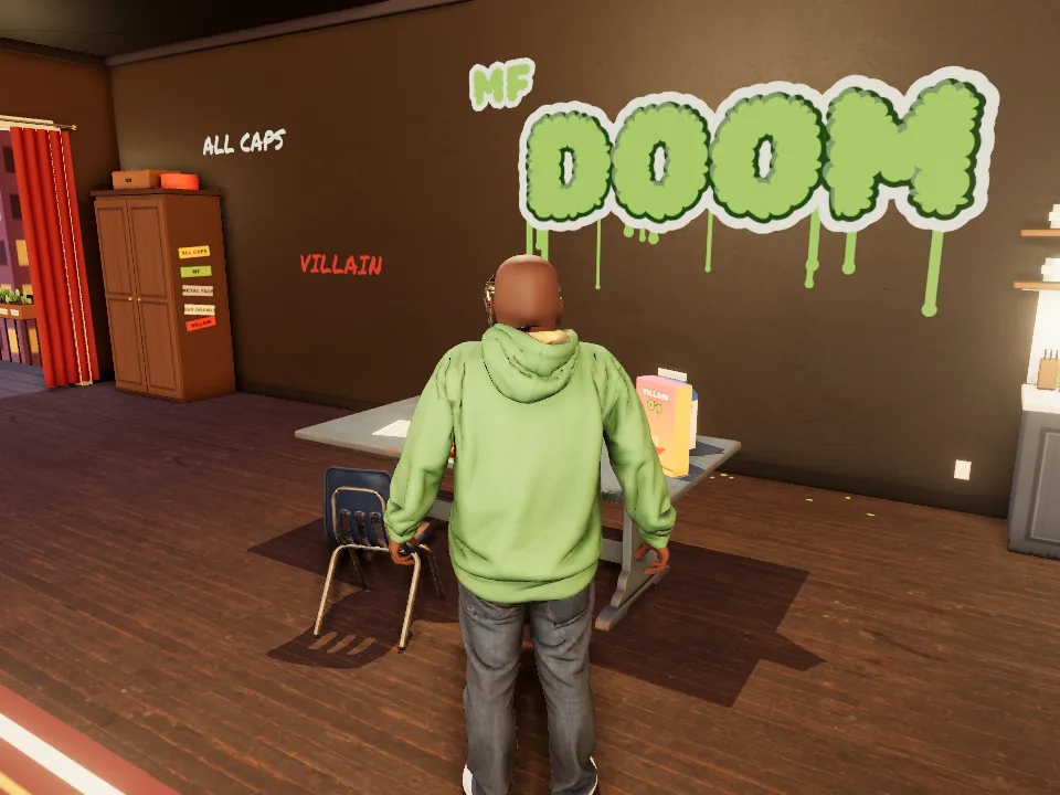 Photoreal
The lesson is about me, not the tool. I was giving good small notes on a direction I hadn't questioned. Claude will happily improve the thing in front of it forever. Asking "is this the right thing?" was my job, and I was late.
05Four DOOMs
One: built from code. Boxes, cylinders, a mask made of plates. Fine for a cartoon. When I asked for realism, Claude proposed sculpting him better in code. I pushed back:
What level of realism are you proposing? It feels like you need to do some research into him first
It went away and researched him properly: build, clothes by era, how the mask sits, how he stood. I sent three reference photos.
Two: a generic human. My next suggestion was to stop building and start finding:
What if we search for models and use those instead. If you're missing a model then build one from scratch.
Claude built a body from open-source human data and dressed it. Better, still a mannequin.
Three: a scanned person. I found a 3D scan of a real man on Sketchfab and asked if it could use that, add a mask, and change the build. Claude asked the right question back (it can only download with my account), so I uploaded the file. It kept the scan's body and clothes, turned the purple hoodie green, removed the head and fitted its own, with a mask model I found separately.
One decision I didn't make and agree with: Claude wouldn't recolour the scanned man's face to turn him into someone else. It removed the head and built a new one. It also painted the brand logos off the hoodie.
Four: less. The last version came from taking things away.
I think we can drop the gilet completely, it looks a mess?
Remove the baseball cap too, it looks like trash, go back to the bald head
Hoodie, jeans, mask. That's him.
06How it works
The short version. Skip it if you came for the prompting.
- The site: plain HTML, CSS and three.js. No framework and no build step. Hosted on Vercel and served at theluckystrike.co.uk/doom.
- The light: a photographed room (an HDRI) lights everything, with soft contact shadows and a little bloom added after each frame. On a slow device it drops to a lighter picture by itself.
- The furniture: 21 scanned models from Poly Haven, all free to use. Claude wrote a script that downloads them, shrinks them and places them.
- The walking: the scan came with one animation, a dance. The walk is worked out live: where each foot should land, then the knee and hip angles to get it there. That's why his feet stay planted and don't slide.
- The music: a small server function turns a track into a fresh 30-second preview from Deezer, with Apple Music as backup. Deezer's links die after about 15 minutes, so each one is fetched when you need it.
- The footsteps: synthesised in the browser, a different sound for wood, rug and balcony.
07How I prompted
The same way as last time: like a design crit. These are my real messages.
Report what you see
After eating breakfast he gets stuck on the chair
his feet also sink into the ground, looks weird
Still messy, wire is half broken, starts from the middle of the floor
No causes, no fixes. Often with a screenshot. Claude found the cause each time, and usually a second bug next to it.
Say when it feels cheap
on the loading screen, remove the jump when the loader has finished and the button appears. that makes it look cheap
the rain needs to be faster, it feels like it lags a bit
"Cheap" and "lags" are feelings. Both got turned into measurements: the layout shift went to zero pixels, the intro animation went to 0.8 seconds.
Question the words
Back into the room is a weird CTA, why is it that
Claude had made the button say something different for returning visitors. It explained why, I said no, and it's now "Enter the room" for everyone.
Ask it a question back
I'd forgotten two of the nineteen secrets and asked for the list, and for a way to hide that list in the interface. Claude proposed a counter you can click. I asked:
would villain give you cryptic hints for the ones that are left?
So that's in. Click the secrets counter and you see blanks. Type villain and each blank gets a clue.
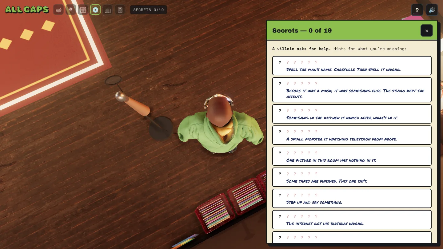
Think about day two
Need to add much more tracks in the crates, that builds longevity. Put in all the special herbs
The crates had seven records. They now have 77, with a counter. It's the cheapest reason to come back that I could think of.
08What broke
| What I saw | What was actually wrong | The fix |
|---|---|---|
| He got stuck on the chair after breakfast, and on the sofa | Standing up put him back inside the furniture's collision box | Each seat has an exit spot on open floor, and he faces the room when he stands |
| The spoon went nowhere near his mouth | The arm maths swung the arm before lowering it, which only twisted it | Lower, then swing, then turn. The eating pose was solved again from scratch |
| His feet sank into the floor | The ankle height was a guess | Measured from the scan: 13.2 cm |
| The cap rendered black | The model's surface-detail map was broken | Flat colours. Then I removed the cap anyway |
| The TV lost its picture | The picture sat behind the screen's glass | Moved in front of the glass and sized to the bezel |
| Drawn album covers flashed up before the real ones | Placeholders showed while the real covers loaded | Blank until the real cover arrives |
| The Doomposter walked through the wardrobe door | The door's panelling was fixed to the room, not the door, so it stayed put when the door swung | Panels and knobs ride on the doors; he walks straight out before turning |
| One side of the wardrobe looked open | The camera had drifted inside it | The camera now stays out of tall furniture |
| The audio player sat on top of the joystick on my phone | The phone layout had grown one fix at a time | One system: notices at the top, controls at the bottom, cards take the whole screen |
| A change I'd approved wasn't on the live site | I merged the pull request before Claude's last push landed on it | Claude now checks what's on main after every merge |
09On a phone
The first phone layout put the music player on top of the joystick. I sent a screenshot. The fix worked and the next screenshot showed a different clash, so I stopped sending clashes:
it all needs a better layout on a mobile device. rethink the system for it, the cards the toasts and the controls. so they don't clash but are workable and make sense
Asking for a system got a system. The top of the screen is for things the room tells you: progress, what's playing, a lyric. The bottom is for your thumbs: joystick left, one green button right, with its label sitting on top of it. Cards and panels take the whole screen and put the controls away.
Then I turned the phone sideways and suggested moving the player to the gap between the joystick and the button. I asked Claude to test my idea against its own system. It agreed, for a reason: sideways, height is what you're short of, and that gap is the only free space.
10What I took from it
Question the direction early. I lost hours improving a style I should have dropped. The tool won't tell you that you're polishing the wrong thing. Ask yourself every hour or so.
Find, don't build. The character got good when we stopped sculpting and started from a scan of a real person. Same with the furniture and the mask. Most of what you need exists and is free to use, with credit.
Taking away is the fastest fix. The gilet, the cap and five art styles all went. Each removal made it better in one message.
Ask for a system when you've sent three screenshots. One clash is a bug. Three is a missing rule.
Details matter. That was my last message before bed, with a list of eight small things. The spoon stopped ten centimetres short of the bowl. His hands were a shade lighter than his face. Nobody would name those, and everybody would feel them. They were fixed by morning.
Go and have breakfast with him. Dig a few herbs out of the crates. And remember: all caps when you spell the man's name.
A fan-made tribute to Daniel Dumile, 1971–2020. Built with Claude Code. Inspired by Jason Jägel's cover painting for MM..FOOD; all art in the room is original. Body scan by OverseerThuror and mask by silentic (both CC BY 4.0, via Sketchfab). Furniture and materials from Poly Haven (CC0). Music previews via Deezer and Apple Music.