My last six side projects were tributes. Five were about hip-hop records and four were 3D rooms. So I asked Claude what to build next, and it asked me four questions back. The answer was a print shop: you pick a house style, set a poster, and a simulated press prints it in two inks.
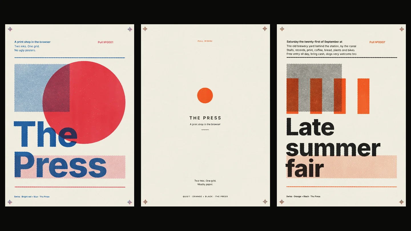
01The idea
This one started with a question, not an idea:
Assessing the side projects, ask me questions about some other interests and see what the next project might be. How can I push the creativity and use of web technologies
Claude read the six projects and said they share a shape. The Basement, Baker's Dozen, ALL CAPS, the Listening Room and Sample Explorer are all about records. In every one you are on your own, digging through something I chose. You never make anything. Only This Is Fine uses what you bring to it.
Then it asked four questions, each with a few answers to pick from. I picked:
- An interest outside records: design craft.
- What the visitor should do: make something.
- Technology to stretch into: WebGPU and shaders.
- How far from the tributes: tie it to design leadership.
It came back with a print shop, and one line that sold it: a photo booth with a strict art director inside. You can't make an ugly one. My reply was two words:
The Press
The design leadership part is the rules. A good design system makes a beginner's work look good, because the limits do the work. That is most of my day job. Here it is a toy.
02Check first
Same rule as the last few: before building anything, find out whether the thing it all rests on is possible. Here that was one question. Can a browser print pass for a real one? If it looked like an Instagram filter, the plan said stop.
Claude asked if I had scans of real riso prints to hold it against. I didn't:
Open source
It found ten openly licensed photos of riso prints, then printed one hard-coded poster and put the two side by side.
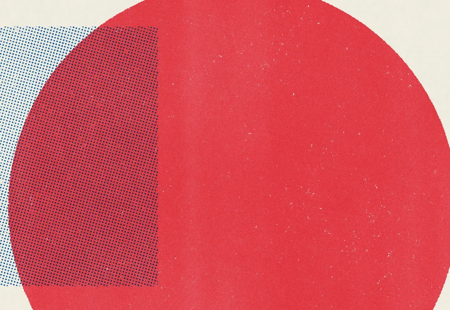 The press
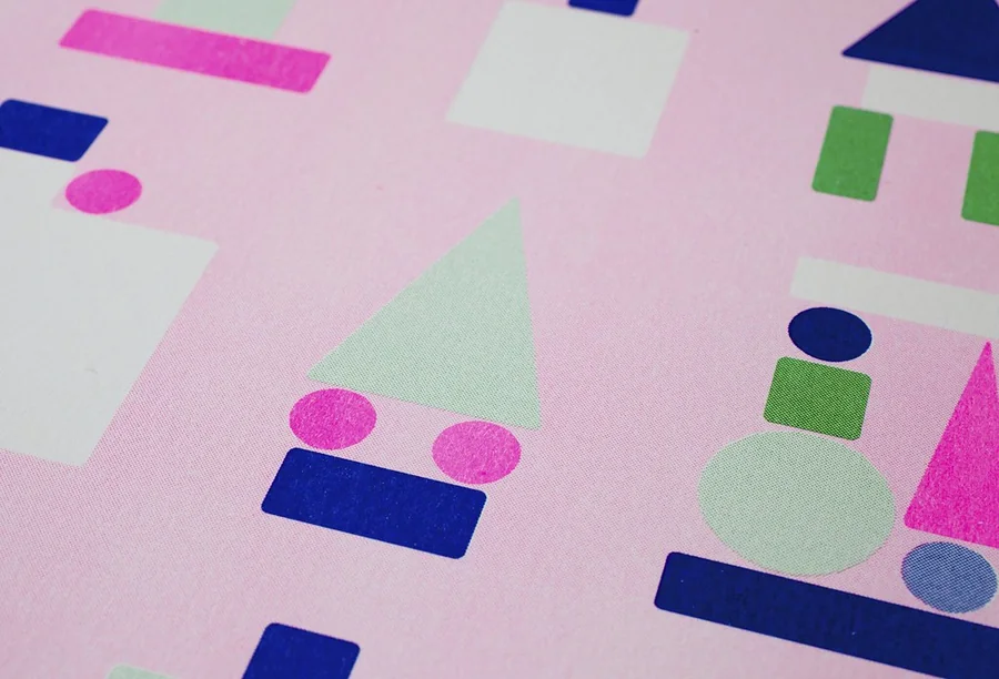 A real one
Claude marked its own work before I did. The speckled solids and the slip between inks were right. The tints closed up to solid too early, and where blue crossed red it went nearly black when it should go plum. It fixed both. Then:
It's a go, start Phase 1
03How the press works
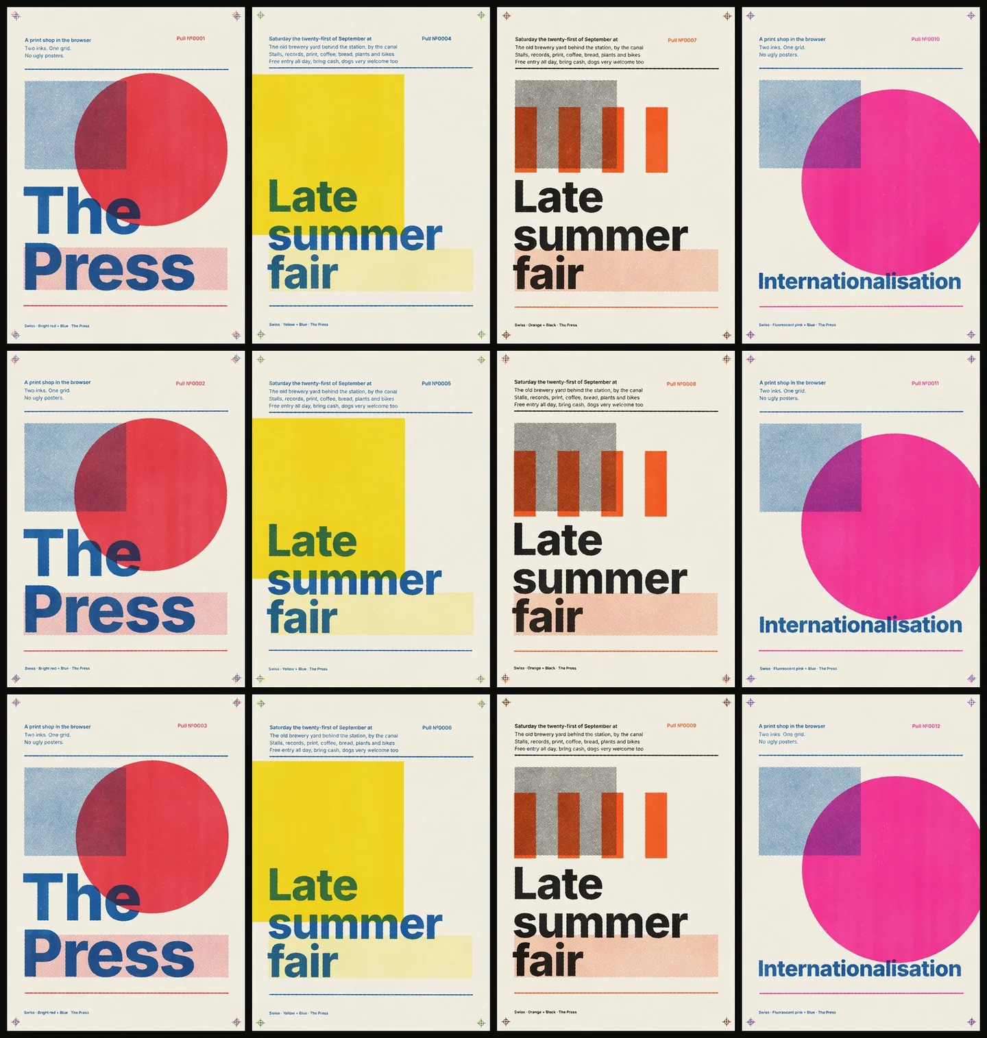
The print is not a photo filter laid over flat artwork. The press is handed one grey picture per ink, where white means full ink, and does what a two-drum riso does:
- Paper. It makes a sheet with fibres, grain and a surface that rises and dips.
- Drums. Each ink goes down in turn. The sheet slips a few pixels and turns a hair between them, so the two never quite line up.
- Dots. Tints are broken into halftone dots, at a different angle for each ink.
- Skip. Where the paper stands proud, the ink misses. That is the speckle in the solids.
- Soak. Wet ink creeps into the paper, further where it is thirstier, so every edge is a little ragged.
- Ink on ink. Each ink is a see-through film. Where two overlap they mix the way ink does and get darker.
The slip, the skip and the paper are different on every pull. No two prints match, and each one carries its own pull number.
I asked for WebGPU because I wanted to stretch. Claude wrote the press that way, then wrote it a second time in the older WebGL2 for phones that don't have WebGPU yet, and ran the same pull through both. The biggest difference on any pixel was 12 out of 255. You can't see it. So the honest finding is that this look didn't need the new technology. It would for a real fluid ink step or a bigger sheet.
04The rules are a file
The first house style is Swiss: twelve columns, one typeface, two weights, flush left, two inks, one big shape. All of that lives in one data file: the grid, the type sizes, how many lines each field gets, which moves you are allowed, and where everything sits. The code that lays out the poster knows nothing about Swiss.
You get three fields and five moves: inks, shape, size, place and tint. That's all. There is no free drawing, because the limits are the point.
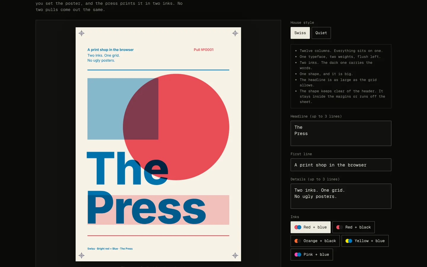 Set it
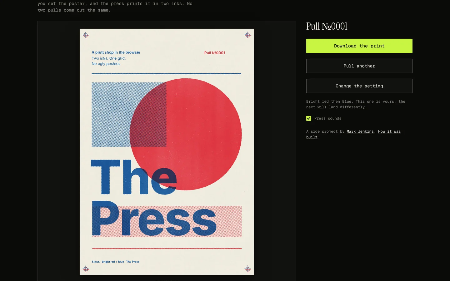 Pull it
Only one rule has any judgement in it. The headline takes the largest size at which its longest line still fits across twelve columns. Everything else is a fixed position.
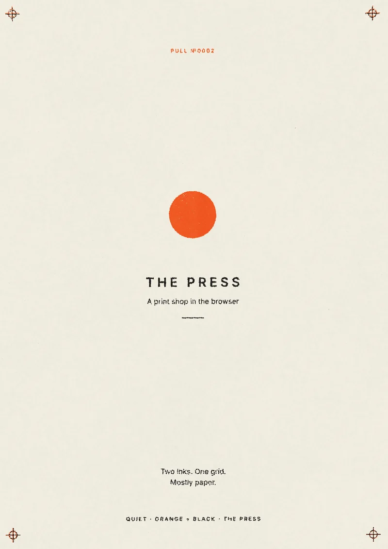
To test whether styles were really just data, Claude added a second one. Quiet is mostly paper: small centred capitals and one small mark in the bright ink. It is one new file. But the layout code had to learn three things first: centred text, letter-spacing and capitals. So a style built from parts the shop already has is pure data. A style that needs a new kind of mark needs a little code, once.
05Try to make an ugly one
The promise was no ugly posters, so the test was to try. I asked how:
how do i make an ugly one
Claude gave me a list of things to try, then offered to try them all itself.
run the sweep and send me the contact sheet
It set 179 posters: ten sets of awkward words, every combination of shape, size, place and tint, and all five ink pairs. Then it sent me the worst eight, each with what was wrong and the rule it would add.
| What was wrong | The rule it added |
|---|---|
| A long word was cut off with "…" | The headline keeps shrinking until it fits |
| A third line of details ran into the rule below it | The rule moved down |
| Yellow small type vanished on the paper | When the bright ink is pale, the dark ink does the fine work |
| No headline left nothing to look at | The press won't run without one |
| A large shape ran over the header | Shapes slide down clear of it |
| A square stopped just short of the edge, like a mistake | A shape stays inside the margins or runs right off the sheet |
| Bars ran through every line of the headline | Bars are cut off above it, and don't come in Large |
| Emoji printed as solid blobs | They are removed as you type |
yes
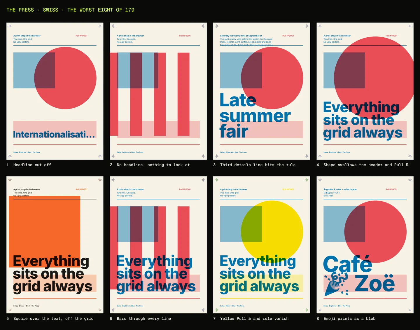 Before
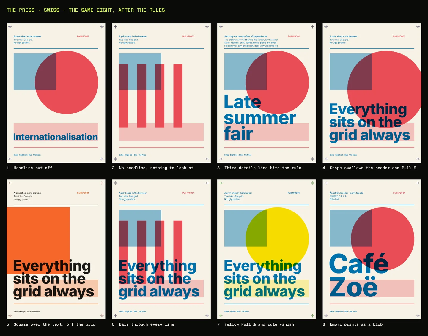 After
Those were flat proofs, so it then pulled 28 real prints. That found something the proofs couldn't. The press was printing a 30% tint as about 5% ink, so the pale blocks the proof promised nearly vanished on paper. Claude printed a ten-step ramp, measured what came out and bent the press's tones until tint in roughly matched ink out.
06What went wrong
| What happened | What it took |
|---|---|
| The machine Claude builds on has no real graphics card, and its stand-in could calculate with WebGPU but not draw to a screen | It checked every print by rendering off screen and reading the pixels back. That became the download |
| A saved backup image, meant only for browsers that can't run the press, was showing underneath the live print | One line of CSS. A phone-sized screenshot caught it |
| The proof promised tints the press didn't print | Measuring a ramp instead of trusting the eye |
| The details field allowed fewer characters than its three lines could hold | Found only by filling it to the limit on a real pull |
| The plan said WebGPU. The fallback matched it | Saying so, instead of pretending the new thing was needed |
| To test the live site, Claude switched off a security check in its test browser | It told me, and said it shouldn't do it that way again |
07How I prompted
Every message I sent, in order. The first is the longest.
Assessing the side projects, ask me questions about some other interests and see what the next project might be. How can I push the creativity and use of web technologies
The Press
Open source
Continue
It's a go, start Phase 1
1?
The repo the-press is created
how do i make an ugly one
run the sweep and send me the contact sheet
yes
fix the last two open things
next
go ahead on 1-3
Add the four answers I picked and one web address I pasted, and that is all fifteen. What I'd take from it:
- Ask to be interviewed. I didn't have an idea. I had six projects that looked alike and four answers to good questions.
- Make it prove the hard part first. One poster next to ten real prints, before any shop was built around it.
- Ask it to break its own work. The sweep found eight ugly posters and a press that lost its tints. I would not have found most of them by clicking around.
- Put the rules in a file. Every fix from the sweep was a line of data or one small rule, and the second style cost almost nothing.
Built with Claude Code. Reference photos of riso prints by Mario Felipe_, leeleblanc, Joe Crawford (artlung), Plusea and mededeler, all CC BY 2.0, found through Openverse. Type on the posters is Inter by Rasmus Andersson (SIL Open Font Licence). The house styles are described, not copied: no label, studio or designer's work is used. Not affiliated with Riso Kagaku Corporation.